Josef Müller-Brockmann was, and still is, one of graphic design's most influential figures. He is considered the father of functional and objective design. Having stood by the use of "organisational systems" and "laws" to create his most famous work, he has gave generations of graphic designers an underlying structure for visual communication in their own designs.
Early life and initial recognition
Born in 1914, Müller-Brockmann grew up in Rapperswil, Switzerland. He studied at the University of Zurich in several areas, including architecture, design, and history of art. In his first step into a professional career he had an apprenticeship to Walter Diggleman, who was a designer and advertising consultant. He later opened his own Zurich studio, in 1936 which specialized in photography, exhibition design, and graphics.
Poster work
Müller-Brockmann favored a no-nonsense approach to his work, where he would give shape to ideas before trying to be "artistic". During the 1950's Müller-Brockmann picked up recognition for his posters, for the concert series Musica Viva, at the Tonhalle Zurich. It was these posters that gave birth to the renowned International Style, and it is in these posters where you can see his methodology the easiest.
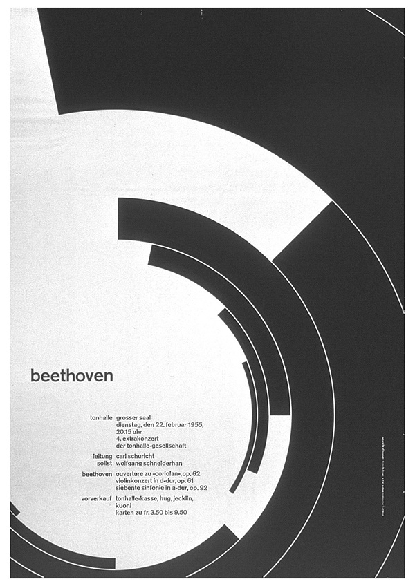
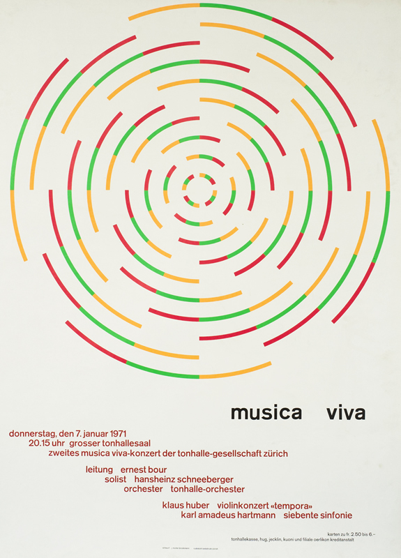
Müller-Brockmann built his work mostly using geometric shapes, where the space between the shapes was as equally important as the shapes themselves, if not more important! All his spacing would follow mathematical ratios and rules to remove any subjective interpretation. He used sans-serif typefaces exclusively, generally all lower-case, to achieve total objectivity. For his composition he used a grid system, of which he is very well known for.
Usage of Type
Müller-Brockmann exclusively used sans-serif type faces in his work, mostly favoring Akzidenz Grotesk, even over it's successors, Helvetica and Univers. He, in an interview, described contemporary, decorative, typefaces as a "shaky foundation", if they have to be used by designers to encourage people to read. He said he wouldn't read something like that unless he had to. While I can see where he is coming from with this statement, I do believe contemporary typefaces have their place in today's age of design if used in a suiting manner, as more contemporary typefaces can better invoke emotion than a more plain typeface, made for readability. I don't agree that total objectivity is always the right way to go, not in expressive design anyway.
“Text is communication of content, a fact reflected in classical typefaces and legible typography.”- Josef Müller-Brockmann
Grid Systems
Müller-Brockmann is considered the father to the usage of Grid Systems in design. With his past experience as a student in architecture, I suppose the usage of grids came naturally to him, as he applied it to graphic design. He has explained that his impulse to apply the grid concept to graphic design didn't only come from his architecture experience, as typography since Gutenberg has striven for order. With the grid being an organisational system, it enabled him to create order optimally. With the grid system, he found creating designs not only became easier, but he was able to design faster, and better. It's very easy to see how the usage of grids appealed to Müller-Brockmann with his fondness to objective work.
“Order was always wishful thinking for me. For 60 years I have produced disorder in files, correspondence and books. In my work, however, I have always aspired to a distinct arrangement of typographic and pictorial elements, the clear identification of priorities. The formal organization of the surface by means of the grid, a knowledge of the rules that govern legibility (line length, word and letter spacing and so on) and the meaningful use of color are among the tools a designer must master in order to complete his or her task in a rational and economic manner.”- Josef Müller-Brockmann, 1 year before his death.
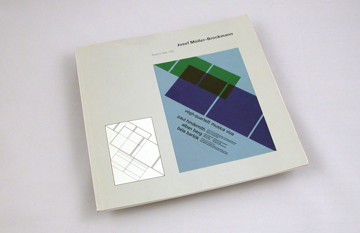
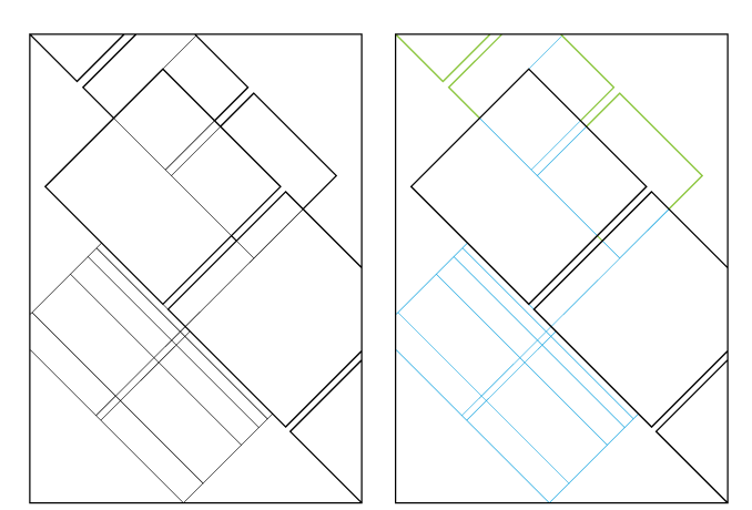
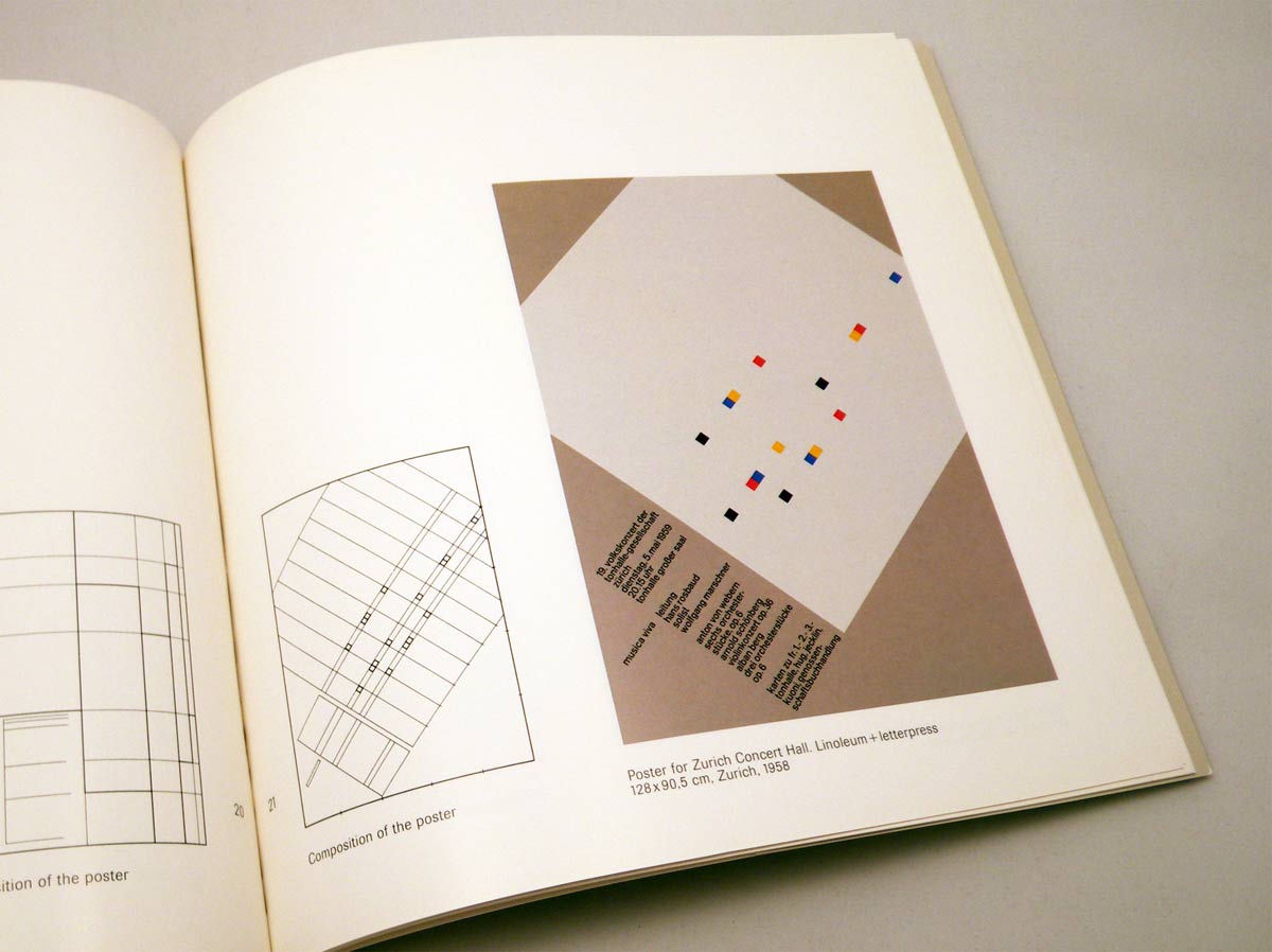
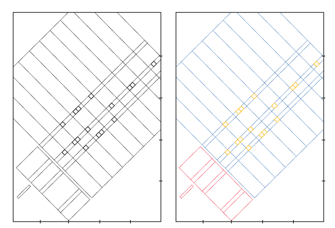
Personally, I absolutely agree with Müller-Brockmann, that the grid system can only help a graphic designer. Even in expressive designs, the grid can excel in helping create cleaner, more focused work. There are obviously times when you can, and should break from the grid, and I believe the real skill in using grids in your work comes from knowing when you can, and should break from its use.
“The grid system is an aid, not a guarantee. It permits a number of possible uses and each designer can look for a solution appropriate to his personal style. But one must learn how to use the grid; it is an art that requires practice.”- Josef Müller-Brockmann
Work with Photography
Müller-Brockmann had experience in photography from his Zurich studio. Like all great designers, he didn't scare from using his knowledge in other subjects to aid his designs, and photography was no exception for him. However, Müller-Brockmann was attracted to photography in his designs for another reason - one that I think is fantastic. This reason was that back then with no Photoshop, photographs did not lie; they were completely objective. A credible snapshot of something that certainly happened with no dispute. Müller-Brockmann couldn't improve textual-pictorial communication through his artistic work, but he could do so through functional and un-manipulative photography.
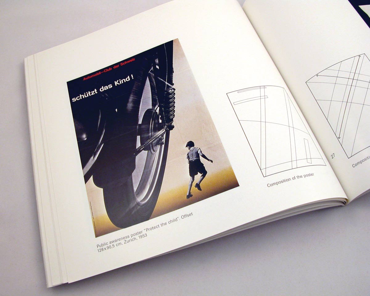
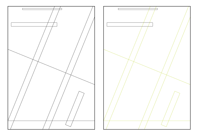
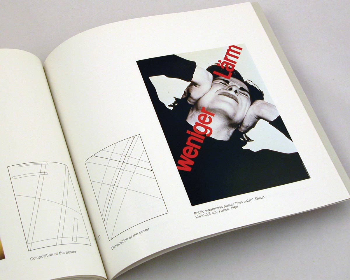
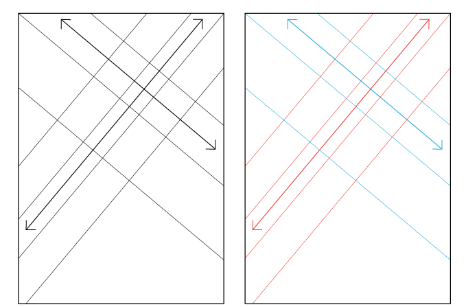
Müller-Brockmann believed that the emotion in images could help produce genuine works of art. Another genuine work of art, in my opinion, would be his usage of photography in his work, which were perfectly composed with his usage of grids. As seen above even the photography in his work conformed to the grid, and it works so well. This is exactly why I believe the usage of the grid is applicable everywhere as an aid, even if it's not necessarily apparent to the consumer of the design.
Teaching
Müller-Brockmann spent much of his later life in teaching. In his teaching he would try to establish a rational-objective foundation that would be accepted by all, so his students could develop from this foundation independently - this would include stuff like the golden section that is understood by all cultures.
He would sometimes give his students an introductory exercise of depicting a dam burst typographically to bring out the difference between expressive and informative design. In my eyes he likely did this to show his students better that the "rules" of graphic design are solid and timeless (useful in informative design) but expressive design can very quickly change over time as aesthetic tastes change.
In a way this line of thought is what made Müller-Brockmann the figure of design that he is today. He stuck to logical, rational concepts, and expanded on them. I honestly think the foundations that he taught could be the most solid foundation any aspiring graphic designer could be taught.
Influence Today
Josef Müller-Brockmann's systems and concepts today are something that every graphic designer should be aware about, in my opinion. It is a fact that today we live in the age of information - everyone can access limitless information with the web, and almost everyone consumes it. Because of this I think informative design is more important to understand than it has been in any other period of history. Müller-Brockman's work and systems are in my opinion some of the best examples and concepts of creating heiarchy and order in information.
With most information today being online, and a lot of graphic designer's focused on the creation of websites or UX, and most consumers of this information reading it on a multitude of platforms, flexibility in displaying this information is extremely important. The reason that Müller-Brockmann used his grid system in design was to create something more flexible than the standard page layout.
The very fact that his systems are still as important to design, if not more important in today's age, is a true testament to how solid a foundation his systems his are to aid graphic designers in the design. It's also a testament to how objective his systems are.
Conclusion
Müller-Brockmann, in my opinion, was a genius in design. I disagree with some of his statements about typography, yet I can still understand his point of view on the topic. In fact, if I was to talk to him today, perhaps he might see my perspective on it, as when he examined some of his past work for the Zurich Tonhalle he was "amazed by how many are bad" and called his design solutions "valid but deadly boring".
While Müller-Brockmann's work is important, I think it's the concepts and the behind the scenes of his designs that the graphic designers of today need to look at. When I first seen that he used grids in the composition of his photography in a layout, I remember feeling a bit shocked at how genius the idea was and how well it worked. Looking at the images now, I can see the grid despite it not really being there, and I can see why the photography is positioned and angled like it is.
Müller-Brockmann's concepts in my opinion should be one of the first thing an aspiring graphic designer should learn as a foundation. He strove for a objective method of design and I believe, he found it, and near perfected it. Because his work is objective I think his work is what every designer should strive for: timeless.